architourism, part V
I’m no architecture critic. But I am, by nature, critical of architecture. I can’t help it. Our latest in a series of mid distance road trips took us to Boston via Niagara Falls, Ontario, Canada. With no real knowledge of the Falls area and no expectations, we were pleasantly surprised to find the second most striking attraction in the area to be the midcentury modern Skylon Tower.

Photo taken on the American side, with the striking Skylon Tower in Niagara Falls, Ontario, Canada in the background. It was designed by Bregman + Hamann Architects and completed in 1965. Look closely and you can see the external ‘yellow bug’ elevator beginning its ascent.
This tower, soaring 700+ feet above the falls, is a raving beauty from the exterior. I’m a sucker for shapes (Saarinen furniture, Jonathan Adler ceramics) and this one is super sexy, rising out of the landscape with grace, beauty, and a bit of Googie moxie. Completed in 1965, it was a continuous concrete pour, round the clock, for 38 days (compared to UC’s Crosley Tower, the infamous brutalist campus building, which was completed in 1969 with an 18 day continuous pour)! That’s 6,000 cubic yards of concrete, folks! The tapered shape of the tower required reducing the size of the slip form as it was inched upward, a precise operation that had not been previously attempted.
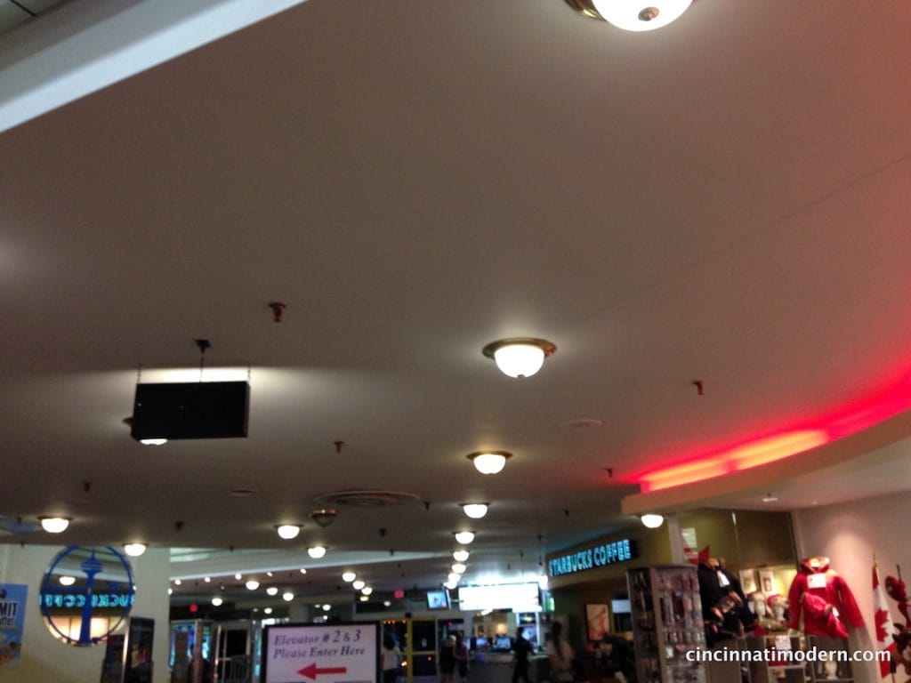
yikes! brass boob lights as far as the eye can see……every single thing added to this building since its construction in 1965 is inappropriate. luckily, lots of the original yummy details are still intact!
Imagine my horror to enter into the building through the game arcade level to find the entire base floor under an endless canopy of brass boob lights! Was the entire building similarly defaced? If this mish-mosh level of 80’s/90’s mediocrity and seemingly lack of maintenance was any indication, hopes were not high. As we stepped into the ‘yellow bug’ elevator pod that raced up the exterior of this edifice, I was heartened to see that it was pretty darn original. When the doors burst open onto the restaurant level, we were greeted with beautiful diamond patterned wood inlay on the walls, and subtle recessed lights on the curving ceiling as if it were still 1965. Did they actually have the forethought to leave well enough alone? The buffet dinner was surprisingly good. The views were breathtaking.
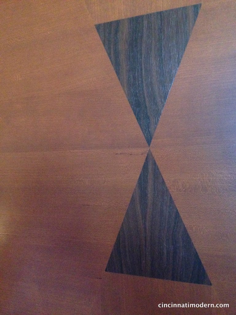
original wood inlay walls in the Summit Suite Buffet Dining Room
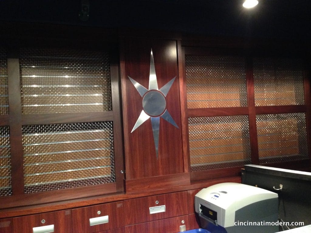
cool vintage detail in an office area on the way to the women’s washroom in the Summit View Restaurant
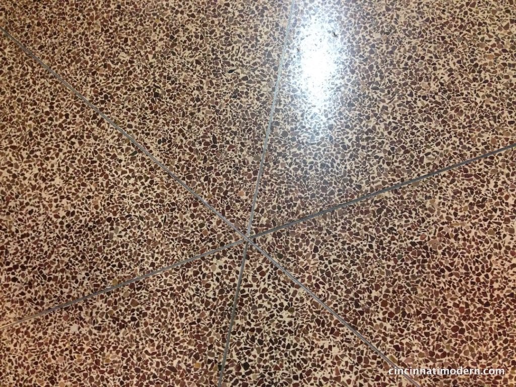
original terrazzo floor detail on the base level of the Skylon Tower.
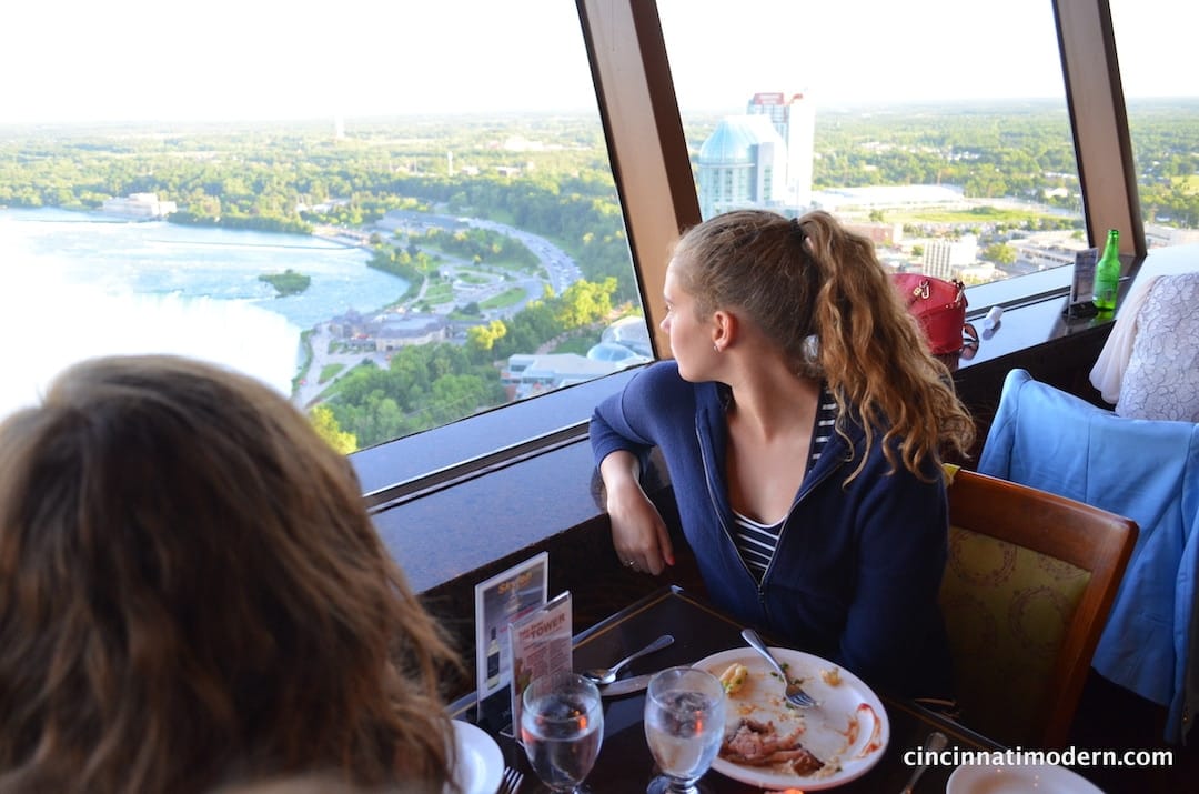
daughters tenley and kirsten take in the view of the falls from the summit view dining room.
One floor up from the restaurant level is the 360 degree indoor/outdoor observation deck. The sunset view of the falls was stunning. You could even see the Toronto skyline way in the distance. The center of this level was the ubiquitous campy gift shop. It was like stepping back in time to 1965. Exactly what I would have hoped for. The journey back down in the yellow bug was just as awe inspiring. But the real treat was walking away and looking back to see the colored lights shooting up the exterior in the now dark night sky. The trap worked on this tourist!
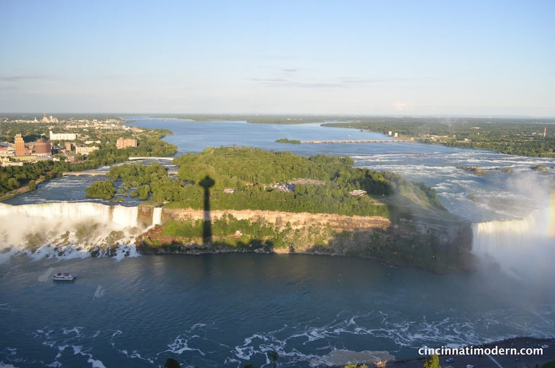
view of the falls from the Skylon Tower – with shadow of the tower!
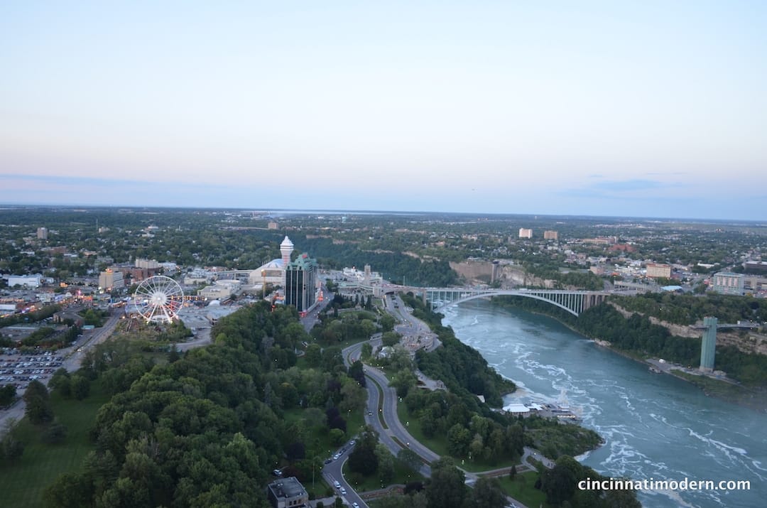
view from the observation deck of the Skylon Tower. photo by tenley rissover
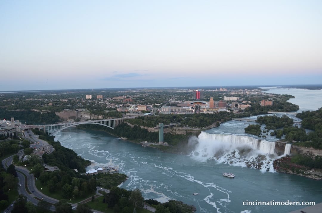
view from the observation deck of the Skylon Tower. photo by tenley rissover
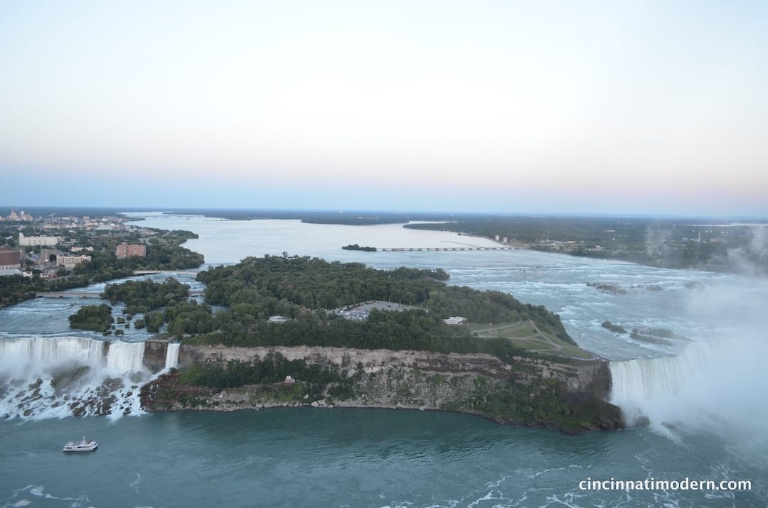
view from the observation deck of the Skylon Tower. photo by tenley rissover
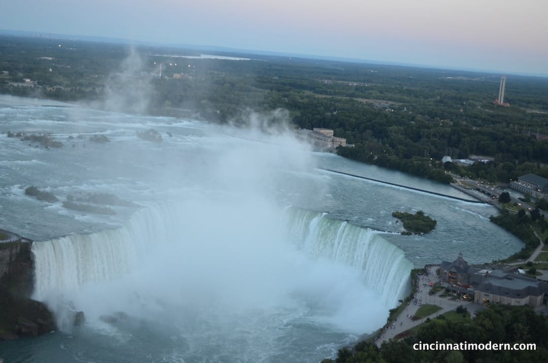
view from the observation deck of the Skylon Tower. photo by tenley rissover
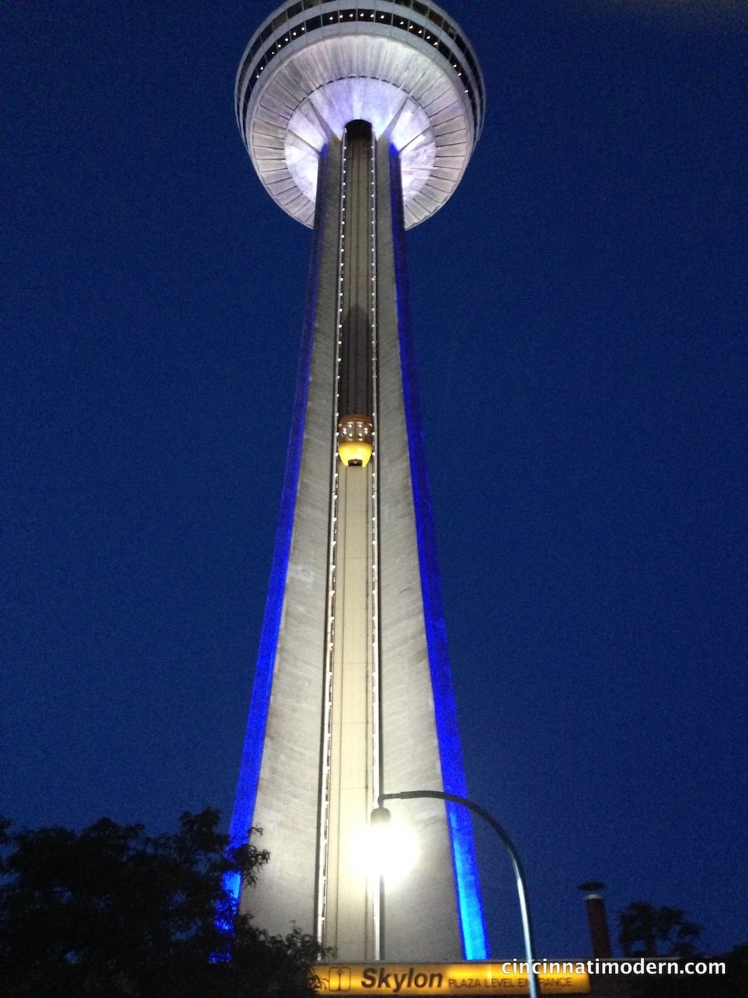
the Skylon Tower at night
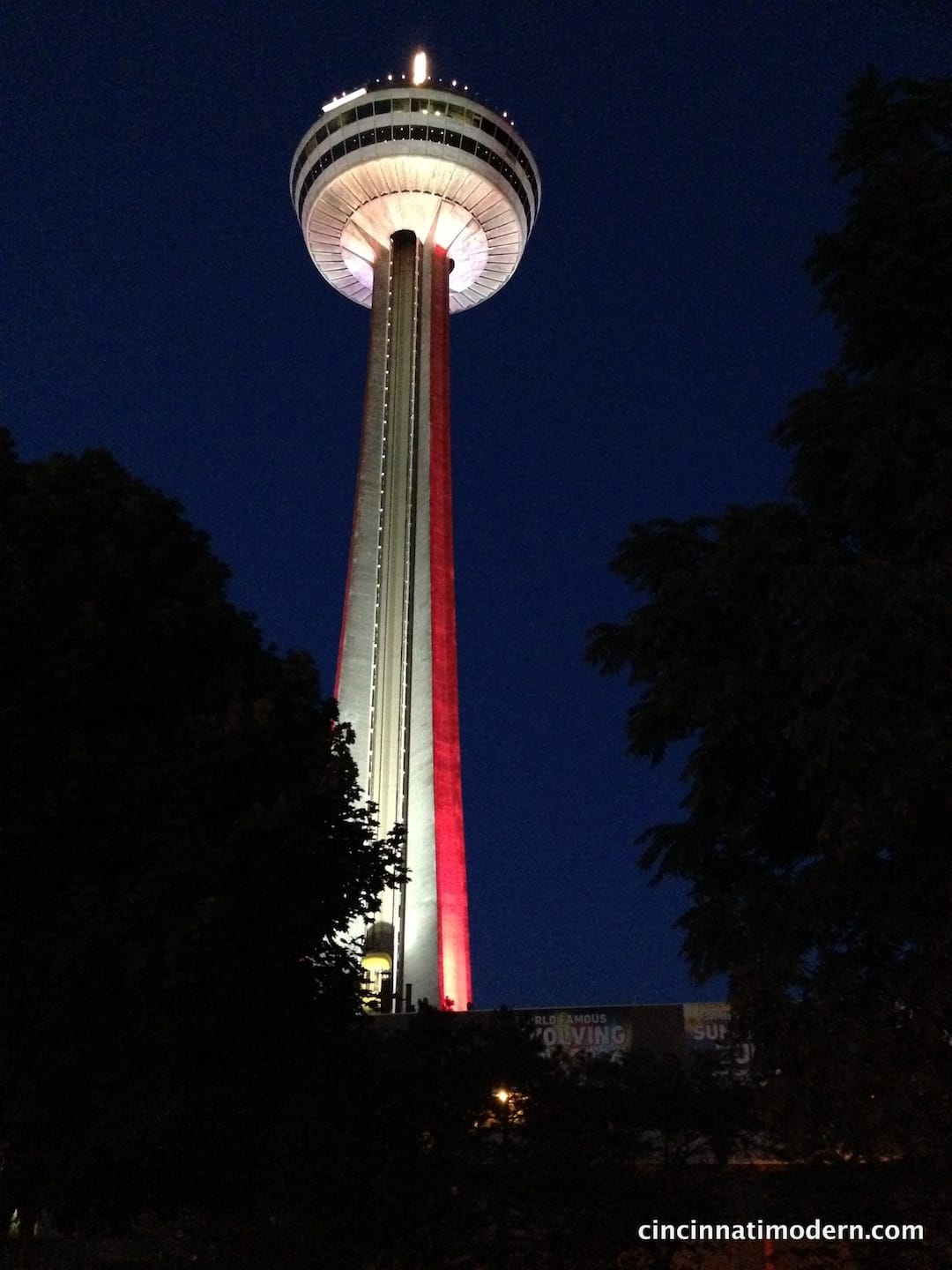
the Skylon Tower at night
the clan on vacation – tenley’s friend sid, tenley, susan, arlen + kirsten rissover. that clunky tower like building in the background is NOT the Skylon Tower!
see these other installments in our architourism series:
mcm architecture geeks invade columbus, in
featured publications
research + articles
- thesis on the work of architect james (jim) alexander melissa marty, 2002
- benjamin dombar various sources
- abrom dombar various sources
- woodie garber various sources
- rudy hermes various sources
- dick calef various sources
- carl strauss + ray roush various sources
- and the rest
modern books
- 50 from the 50s: modern architecture and interiors in cincinnati udo greinacher, elizabeth meyer, susan rissover, patrick snadon, margo warminski, 2002
- atomic ranch midcentury interiors michelle gringeri-brown (author), jim brown (photographer), 2012
- implosion elizabeth garber, 2018
- charley harper, an illustrated life, todd oldham & charley harper, 2007
- about design: insights and provocations for graphic design enthusiasts, gordon salchow, 2018
- cincinnati's terrace plaza hotel: an icon of american modernism, shawn patrick tubb, 2013


0 Comments