streamlining an art moderne (part 3)
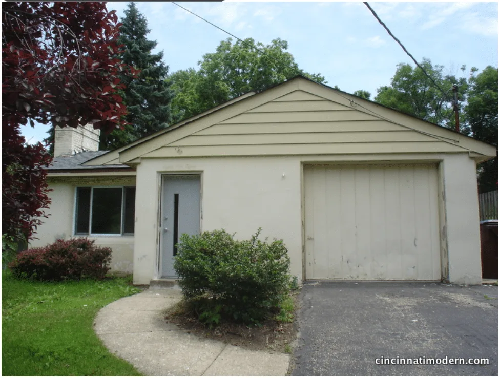
Front with new door – and the rest of the house in the process of being scraped….
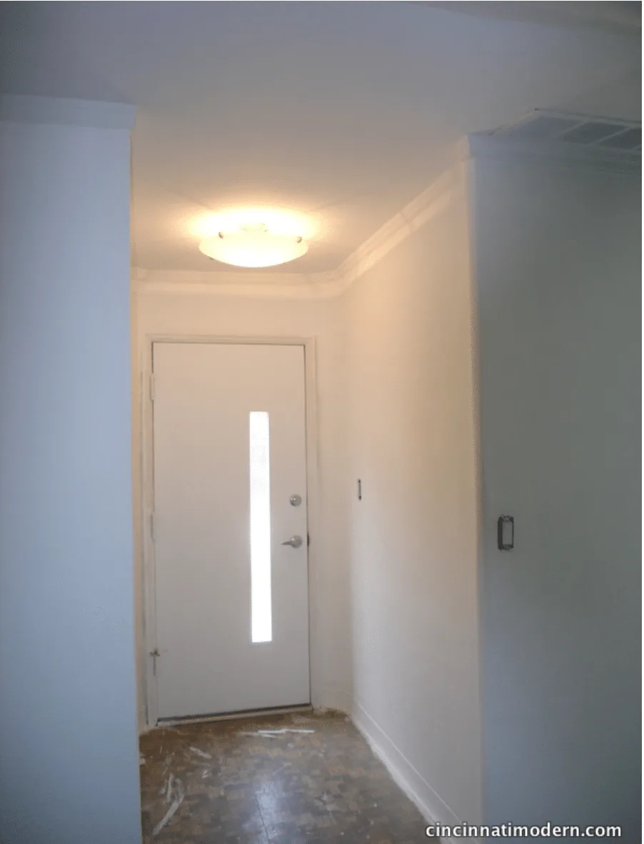
Inside view of the new door and the entry hall. We swapped out an ugly light fixture for this art moderne inspired one. The hideous vinyl tile floor will be replaced with cork next week!
Things are really starting to take shape at our Art Moderne project. The new front door has been painted. The pass through between the kitchen and dining room is being finished and the counter has been installed. The new cork flooring is going down (with a special vapor barrier / insulating pad under designed for use over concrete floors). Less than half of the house has the new flooring and already the sound quality in the house is greatly improved – it just feels, looks and sounds warmer. Seriously, there is nothing as hollow sounding as an empty concrete house!
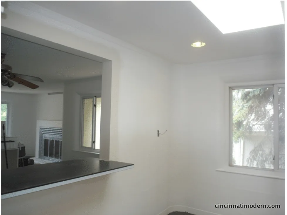
Kitchen pass through in progress. This formerly small and cave-like kitchen will now have not only more counter space, but a breakfast bar as well! The ceiling fan in the dining room is being launched next week!
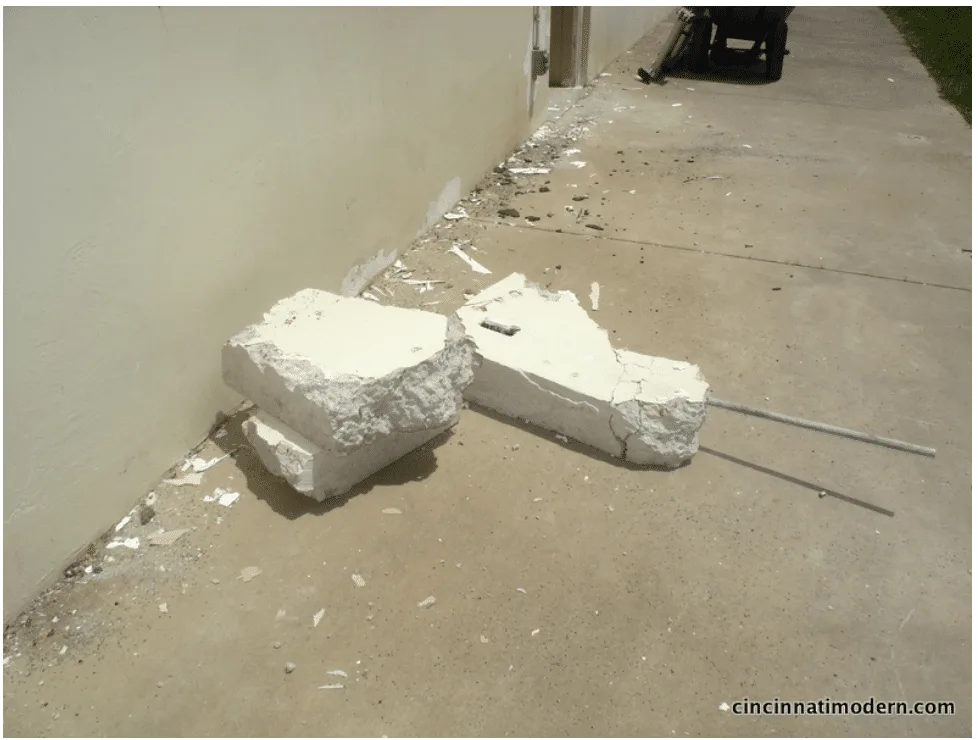
These are chunks of the kitchen wall that was removed. Look how thick! Can you imagine? This house stays very cool on hot days!
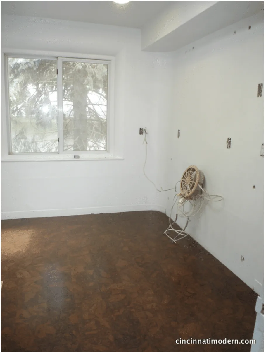
Cork floor – we chose this warm dark brown color similar to the wood tone in our house. It’s a great contrast to the white walls.
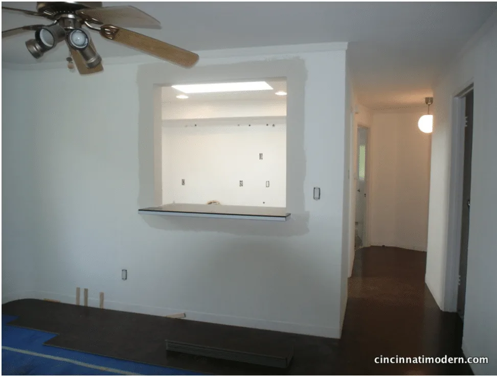
Another view of the pass through and floors in progress.
Possibly the biggest visual improvement so far was a relatively simple project. The massive fireplace was painted in the same unfortunate color palette as the rest of the house, with the formed concrete ‘tubes’ around the opening painted black. We masked off all of the surrounding area and went at the ‘tubes’ and the fireplace door with Professional Rustoleum spray paint in ‘Aluminum.’ This ties in with the aluminum edging on the kitchen counters and adds a more period appropriate look (and material) to the house. It also really highlights this beautiful fireplace as a feature and not just a black hole in the wall.
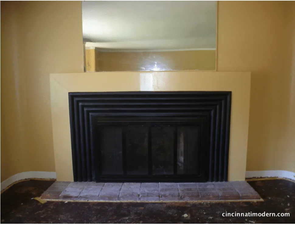
Fireplace ‘before’
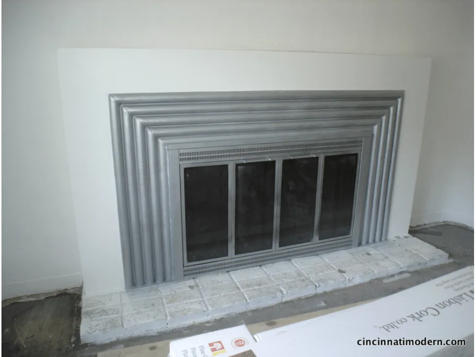
Fireplace after our treatment with the aluminum paint. The utility brick hearth will be painted black – because the pinkish brick color just didn’t fit in with anything else inside or outside the house!
Next week, we hope to finish laying the cork floors and set the kitchen cabinets. I can’t wait! Stay tuned for more….
featured publications
research + articles
- thesis on the work of architect james (jim) alexander melissa marty, 2002
- benjamin dombar various sources
- abrom dombar various sources
- woodie garber various sources
- rudy hermes various sources
- dick calef various sources
- carl strauss + ray roush various sources
- and the rest
modern books
- 50 from the 50s: modern architecture and interiors in cincinnati udo greinacher, elizabeth meyer, susan rissover, patrick snadon, margo warminski, 2002
- atomic ranch midcentury interiors michelle gringeri-brown (author), jim brown (photographer), 2012
- implosion elizabeth garber, 2018
- charley harper, an illustrated life, todd oldham & charley harper, 2007
- about design: insights and provocations for graphic design enthusiasts, gordon salchow, 2018
- cincinnati's terrace plaza hotel: an icon of american modernism, shawn patrick tubb, 2013


